Eunoia: Hearing Aid App Design
Creative Circus Project
Opportunity
Although hearing loss is normally attributed to people 60+, many people aged 30-50 need hearing aids. Unlike glasses, hearing aids still have a large stigma attached to them which keeps people from getting one. The idea for Eunoia was born from this. What if a hearing aid wasn't a clunky thing for "old people", but a functional and beautiful item that works with the fast-paced lifestyle of today's world?
Product & Logo Design
Eunoia is meant to embody sleek, modern design. The parent company Bang & Olufsen is known for their superior sound technology and high-quality design, so it was a natural extension of the brand. We wanted Eunoia to look high-tech, breaking the typical perception of hearing aids.
App Design
When researching users with hearing aids we found that what people dislike the most is the constant modification of settings to fit the surroundings they are in. Eunoia takes away this pain point by using your phone to detect your location, and then modifying the settings accordingly.
Psst I'm a prototype. Click me to explore the app.
Onboarding
When the user first sets up the app they answer a series of questions about their lifestyle.
Questions are easy to understand and non-technical, taking away the confusion of adjusting settings
The answers to the questions are used to create presets
The presets can be changed any time in the presets section
Home Screen
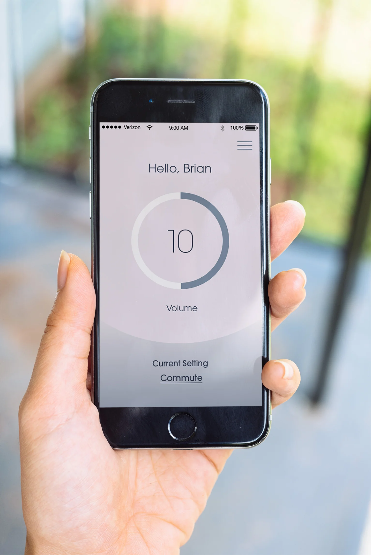
The home screen focuses on volume control, which is the most important feature to our users
The bottom of the screen allows users to quickly change between settings, the second most important aspect to users
Map
Eunoia makes using a hearing aid easier than ever with the map feature of the app
Users can pin locations to their map so that next time they go to the location their hearing aid will automatically adjust its settings
The map also comes pre-programed with popular locations, so that users do not need to pin them
Presets
The presets section of the app allows users to access the settings and view pinned locations for presets
This is where the user could adjust the answers to their questions from the onboarding section
Serenity
The Serenity section of the app allows the hearing aid to connect to meditation apps or sleep playlists.
These were included as they were of interest to our target demographic
Design Process
Sketches
A selection of the initial sketches for Eunoia.
Annotated Wireframes
Annotated wireframes showing the first 4 versions of the Eunoia app before moving to the visual design.
UI Style Guide
The colors used in Eunoia are calming, mimicing the idea of the clarity of sound.
Circular elements are used to evoke the idea of sound waves.


